An important point for PowerPoint presentations is to choose a suitable font that is easy to read but at the same time shouldn't be boring. Are you still looking for a good font for your presentation? We have listed a few tips for you here.
Serif or Sans Serif font?
Serif fonts are fonts that have fine lines at the end of the letters, such as the Times New Roman font. They are especially used in print.
Fonts without serifs appear more modern and are easier to read, which is why it makes sense to use a sans serif font for the texts. The resolution of these fonts is also better on the beamer, which is why they are mostly used for presentations.
However, you should always pay attention to the topic you are giving your presentation on. Above all, you should bear in mind that serif fonts tend to look older, while sans-serif fonts look modern. Think about what you want to communicate with your presentation and then choose a suitable font.

Which fonts look good together?
To avoid your presentation looking messy or confusing, do not combine more than 2 fonts. It is best to use a different font for headings than for bullet points.
When combining different fonts, make sure that the two fonts are not too similar and that they differ from each other. The contrast between them should also not be too great, otherwise the whole thing will look inharmonious. It makes sense to combine a serif font with a sans serif font.
Another possibility is to combine fonts from the same font family. The contrast is usually created by different stroke widths and the text looks harmonious.

What is a good font size for PowerPoint presentations?
When choosing the font size, it is best to consider where the presentation will be given and how far away the audience is. The font should be large enough to be easily read from the very back.
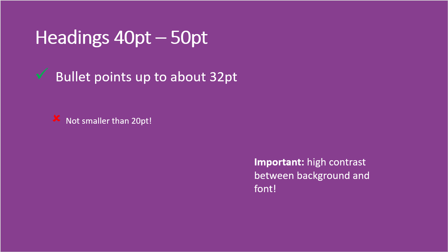
Headings should be somewhere between 40pt and 50pt.
The individual bullet points should not be smaller than 20pt and can be up to about 32pt.
To make the presentation easy to read, it is important to have a high contrast between the background and the font. It is best to always use a light font on a dark background or vice versa. The best contrast is between black and white.

Best fonts for PowerPoint
So finding the best font for you depends on many factors. But we have listed a few fonts here that do well in presentations.
Verdana
![Font Verdana for PowerPoint]()
This is a rather new font and therefore optimised for the screen. Its particularly wide spaces make it easy to read.
Segoe UI
![Font Segoe UI for PowerPoint]()
Like Verdana, Segoe UI is particularly easy to read on the screen. Its narrower character spacing also makes it very suitable for headlines.
Corbel
![Font Corbel for PowerPoint]()
Corbel appears very organized, clear and serious. It has also been optimised for presentations and is still easy to read even at greater distances.
Palatino
![Font Palatino for PowerPoint]()
Palatino is a rather unusual font that stands out from all the default fonts. It looks very elegant and is easy to read.
Garamond
![Font Garamond for PowerPoint]()
This is one of the oldest fonts and is more of a font style that includes fonts such as Garamond ITC and Adobe Garamond.
Tahoma
![Font Tahoma for PowerPoint]()
Tahoma is a very legible and clear font that is especially popular for presentations.
Century Gothic
![Font Century Gothic for PowerPoint]()
Century Gothic has a geometric style and is particularly suitable for headlines and small amounts of text.
Script, italic and decorative fonts tend to read slowly and interrupt the flow of reading. It is better to avoid such fonts in your presentations.

Download fonts for PowerPoint
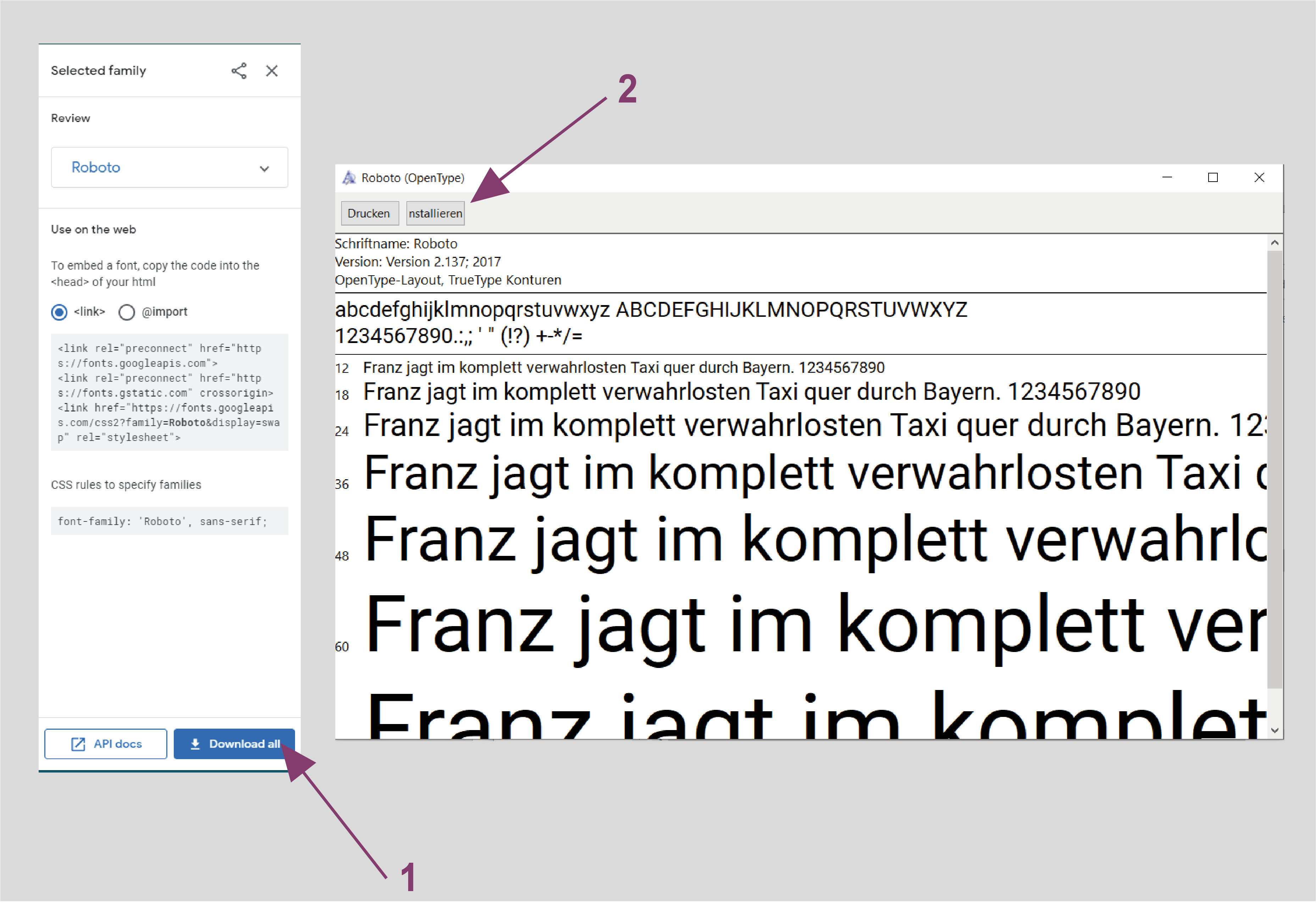
Would you like to use a font that has perhaps not been seen that often? Then you can also search for a nice font for your PowerPoint presentation on Google Fonts and download it for free.
When you have found a suitable font, select it and click on Download. Then open the ".ttf file" and click on Install. You can now use the font in your PowerPoint presentation.

Embed fonts in PowerPoint
If you now use one of the fonts you have downloaded, there is only one problem you need to be aware of.
You may be giving the presentation on another computer that does not have the font installed. Your selected font will then simply be replaced by a standard font so that at least the text can still be read.
What you can do about this and how to embed fonts in PowerPoint can be read here.
FAQ
What is the best font for PowerPoint?
Some fonts that will look good in your presentation are: Verdana, Segoe UI, Corbel und Tahoma. But finding the right font for your PowerPoint depends on many factors. We have written down some tips for you to find the best font.
What is the best font size for PowerPoint?
The font should be large enough to be easy to read even at greater distances. Headings should be somewhere between 40pt and 50pt in size. Bullet points should not be smaller than 20pt and can be up to about 32pt.
Which fonts look good together in presentations?
Do not combine more than 2 fonts in your presentation. Use one for headings and one for the bullet points. If you combine different fonts make sure that they are not too similar but also that the contrast between them is not too great. A good combination for example is Cambria and Calibri.


