Creating and giving a good presentation is actually not that difficult. If you know how to do it. Otherwise, no matter how much effort you put into it, it can quickly turn out to be a bad presentation.
Here we show you some examples of bad PowerPoint slides and common mistakes that are often made in presentations so that you won’t make them in your next presentation and avoid "Death by PowerPoint".
1. Reading aloud instead of speaking freely
One aspect in bad presentations is often that the text is simply read out. Prepare your presentation so well that you can speak freely. The goal is to build a connection with your audience and get them excited about your topic. However, this will hardly be possible if you only read from a piece of paper or your computer the whole time. Your audience should feel addressed, if you just read off, they will be bored and perceive your presentation as bad, even if your content and your PowerPoint are actually good.
2. Technical Problems
The sound of the video you inserted on a slide is not on, your laptop does not connect to the beamer, or your microphone does not work. These are just some of the problems that could occur during your presentation.
But nothing is more annoying than when technical problems suddenly occur during a presentation or even before, when everyone is waiting for it to start. It interrupts your flow of speech, only distracts the audience from the topic and breaks concentration. So before you get started with your presentation, it is important to first start your PowerPoint in the place where you will give it later, practice there and familiarize yourself with the technology.
Some tips to avoid technical problems:
- Don't forget the charging cable for your laptop
- Find out beforehand how you can connect your laptop to the beamer. Find out which connection the beamer has and which connection your laptop has. To be on the safe side, take an adapter with you.
- Always have backups of your presentation. Save them on a USB stick and preferably also online in a cloud.
- Take a second laptop and maybe even your own small projector for emergencies. Even if it's not the latest model and the quality is not that good: better bad quality than no presentation at all.
3. Losing the attention of your audience
One of the most common mistakes in presentations is to lose the attention of your audience. Especially in long presentations it is often difficult to keep your audience’s attention and to avoid “Death by PowerPoint”. Anyone who has had this experience knows how uncomfortable it is to give a presentation where you notice that no one is actually really listening to you. Especially if your presentation is an eternally long monologue, it is difficult to get the topic across in an exciting way and to captivate the audience.
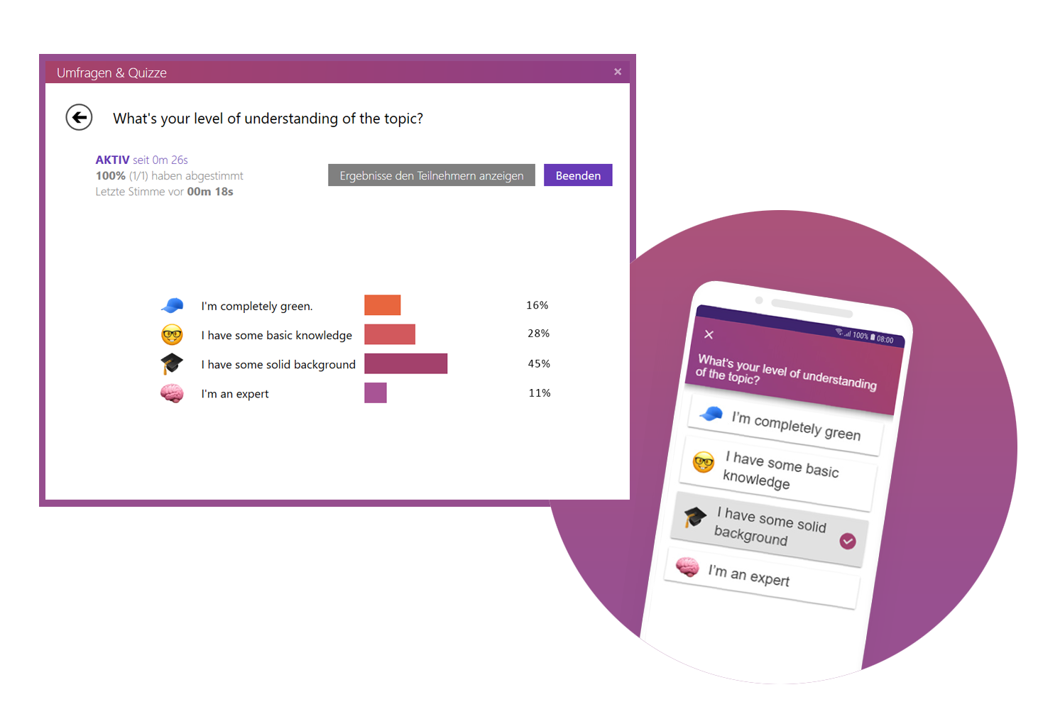
Our tip: Include interactive polls or quizzes in your presentation to involve your audience and increase their attention. With the help of SlideLizard, you can ask questions in PowerPoint and your audience can easily vote on their own smartphone. Plus, you can even get anonymous feedback at the end, so you know right away what you can improve next time.
Here we have also summarized further tips for you on how to increase audience engagement.
4. Avoid eye contact
You want your audience to feel engaged in your presentation, but if you avoid eye contact the whole time, they certainly won't. Avoid staring at just one part of the wall, at your paper or your computer. If the participants have the feeling that you are just talking to the wall, it is a bad presentation. Speak to your audience, involve them in your presentation and make it more exciting for them.
But also make sure you don't always look at the same two or three people, but address everyone. If the audience is large, it is often difficult to include everyone, but still try to let your eyes wander a little between your listeners and look into every corner of the room.
5. Speaking incoherently
Avoid jumping from one topic to the next and back again shortly afterwards. Otherwise your audience will not be able to follow you after a while and their thoughts will wander. To prevent this, it is important that your presentation has a good structure and that you work through one topic after the other.
Nervousness can cause even the best to mumble or talk too fast in order to get the presentation over with as quickly as possible. Try to avoid this by taking short pauses to collect yourself, to breathe and to remind yourself to speak slowly.

6. Many colors mixed with each other
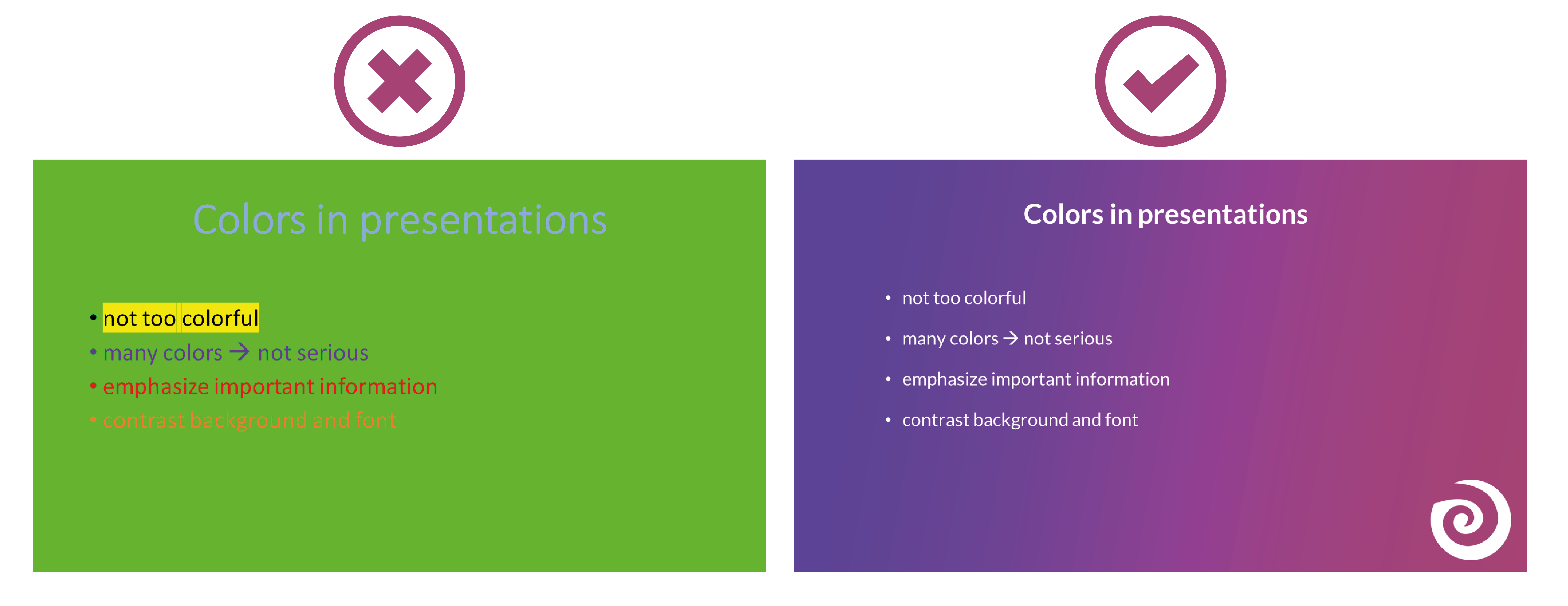
Make sure that your presentation is not too colorful. If you mix too many colours, bad presentation slides will result very quickly. A PowerPoint in which all kinds of colors are combined with each other does not look professional, but rather suitable for a children's birthday party.
Think about a rough color palette in advance, which you can then use in your presentation. Colors such as orange or neon green do not look so good in your PowerPoint. Use colors specifically to emphasize important information.
It is also essential to choose colors that help the text to read well. You should have as much contrast as possible between the font and the background. Black writing on a white background is always easy to read, while yellow writing on a white background is probably hard to read.
7. Too minimalistic design
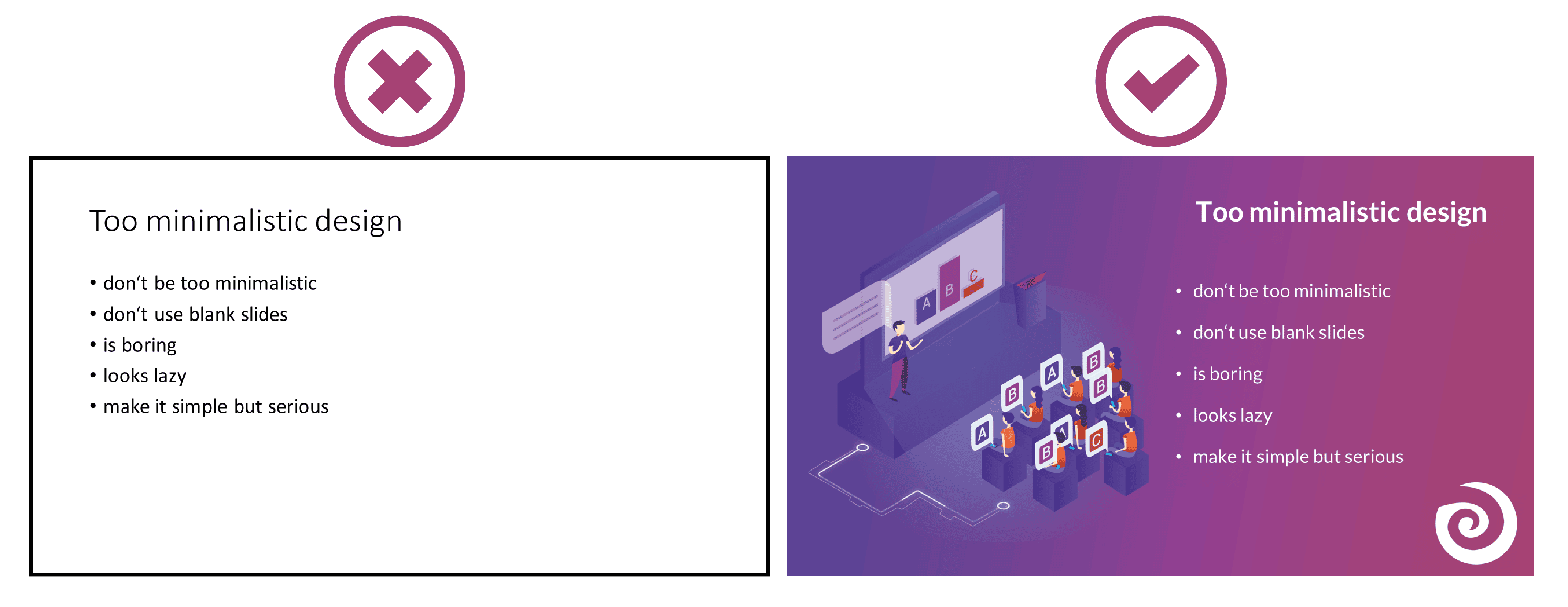
Even though it is often said that "less is more", you should not be too minimalistic in the design of your presentation. A presentation where your slides are blank and only black text on a white background is likely to go down just as badly as if you use too many colors.
Empty presentations are boring and don't really help to capture the attention of your audience. It also looks like you are too lazy to care about the design of your presentation and that you have not put any effort into the preparation. Your PowerPoint doesn't have to be overflowing with colors, animations and images to make it look interesting. Make it simple, but also professional.
8. Too much text
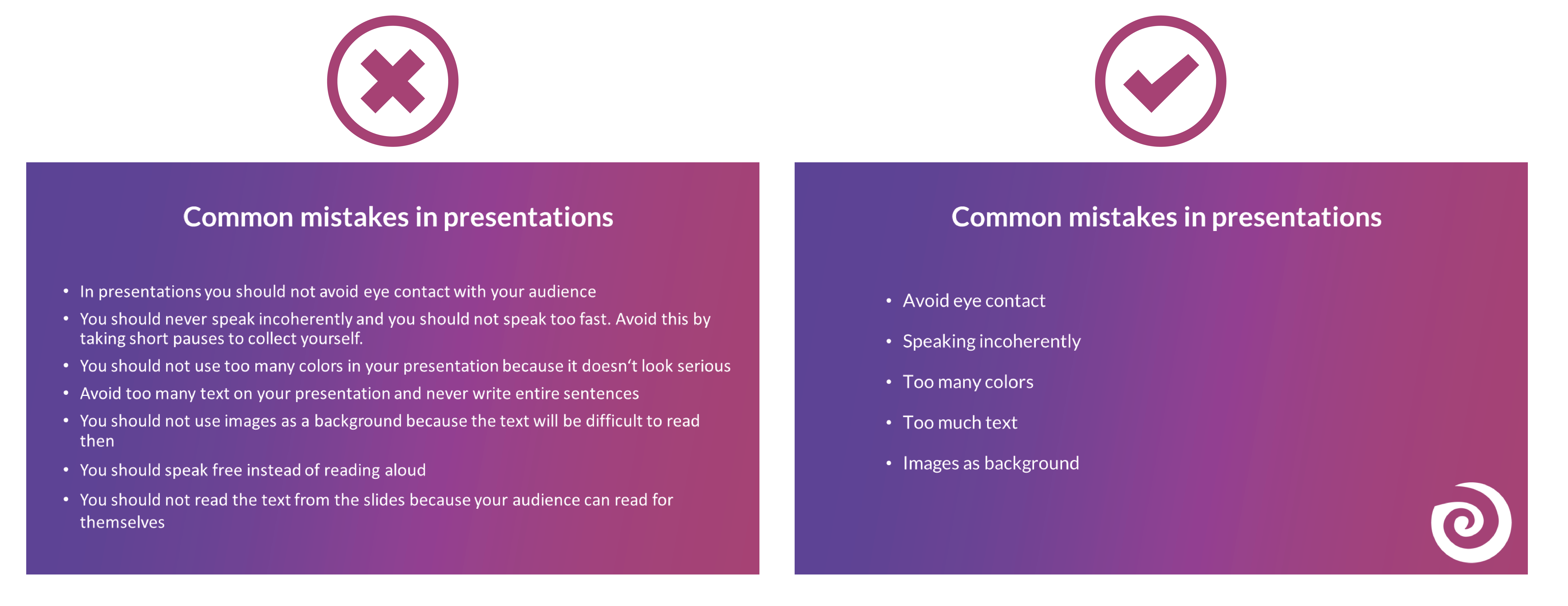
The slides of your presentation should never be overcrowded. Write only the most important key points on your slides and never entire sentences. Your audience should not be able to read exactly the text you are speaking in your PowerPoint. This is rather annoying and leads to being bored quickly. Summarize the most important points that your audience should remember and write them down in short bullet points on your presentation.
9. Many different animations
To avoid bad presentations it is important to never use too many animations. It looks messy and confusing if every text and image is displayed with a different animation. Just leave out animations at all or if you really want to use them then use them only very rarely when you want to draw attention to something specific. Make sure that if you use animations, they are consistent. If you use transitions between the individual slides, these should also always be kept consistent and simple.
10. Too many images
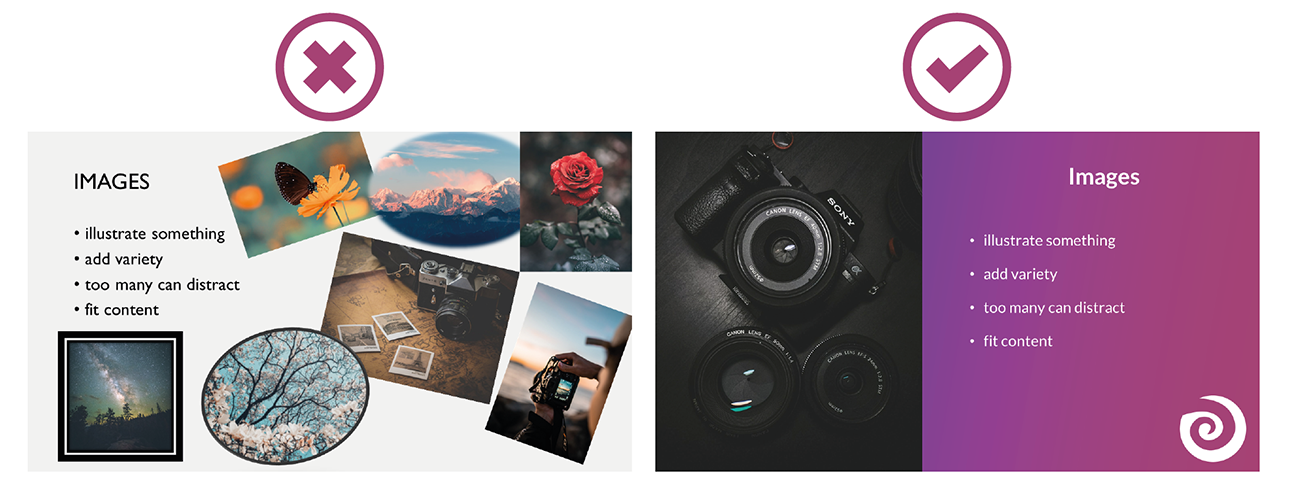
Bad presentation slides often occur when their design ist unclear and unorganised. Images and graphics in presentations are always a good idea to illustrate something and to add some variety. But don't overdo it with them. Too many images can distract from your presentation and look messy. Make sure that the graphics also fit the content and, if you have used several pictures on one slide, ask yourself whether you really need all of them.
11. Too many or unreadable fonts
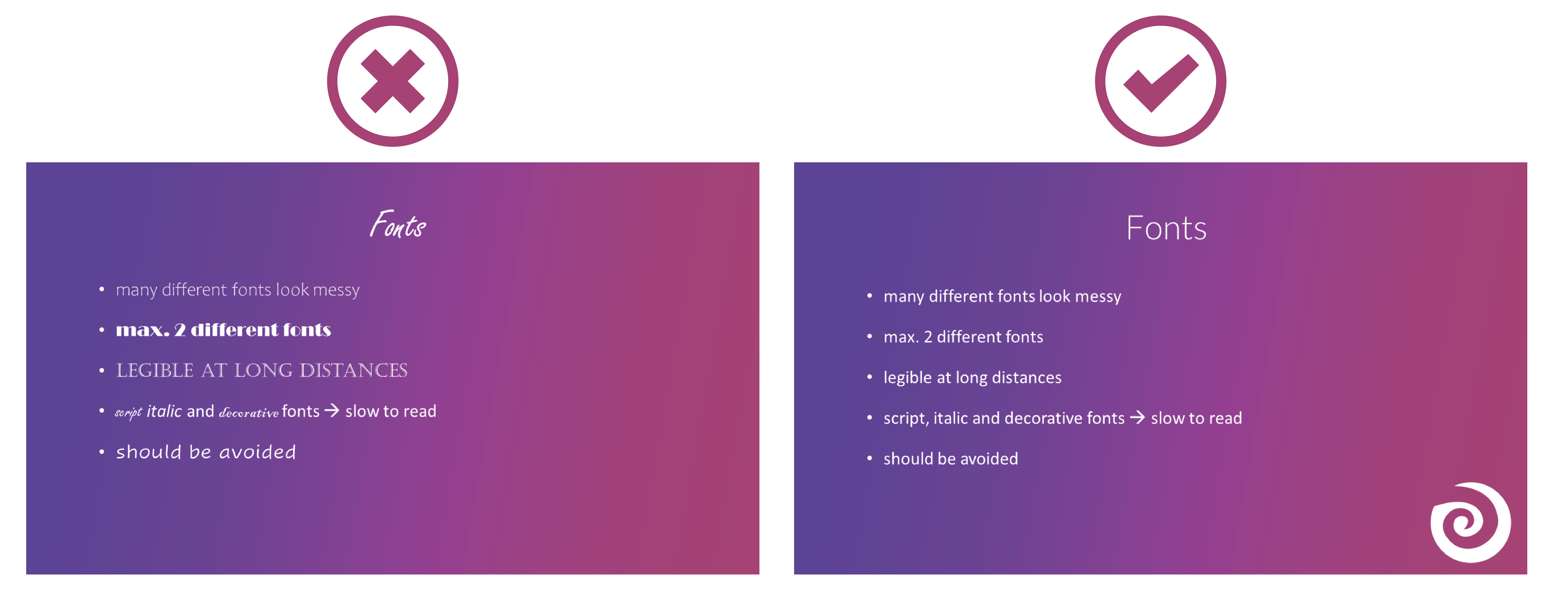
Never combine too many fonts so that your presentation does not look messy. Use at most two: one for headings and one for text. When choosing fonts, you should also make sure that they are still legible at long distances. Script, italic and decorative fonts are very slow to read, which is why they should be avoided in presentations.
It is not so easy to choose the right font. Therefore, we have summarized for you how to find the best font for your PowerPoint presentation.
12. Images as background
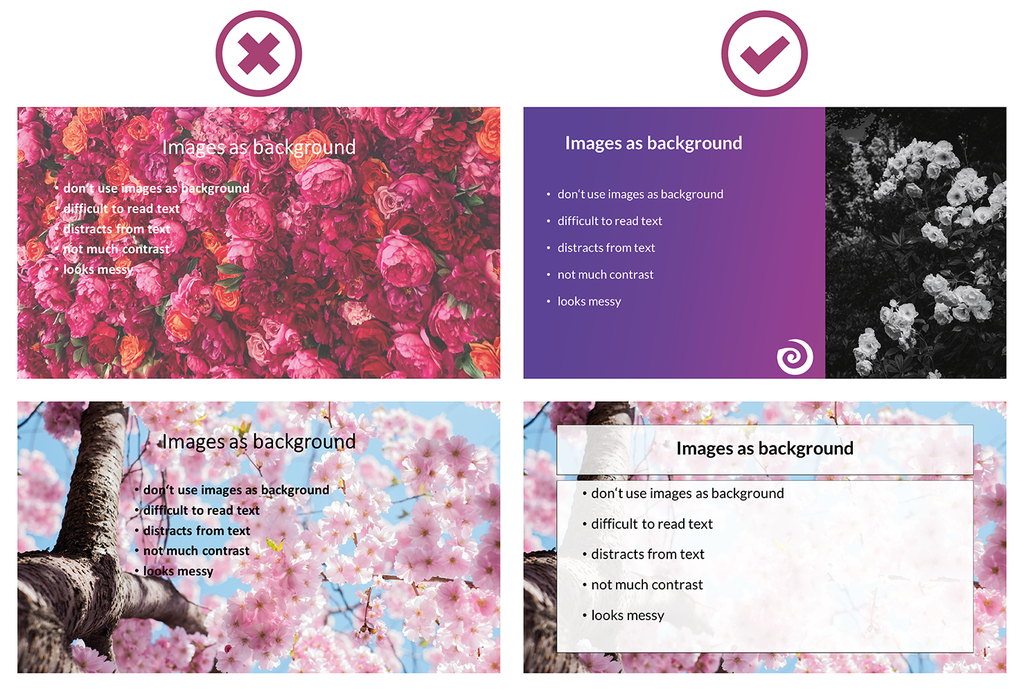
To avoid bad presentations, do not use images as slide backgrounds if there should be also text on them. The picture only distracts from the text and it is difficult to read it because there is not much contrast with the background. It is also harder to see the image because the text in the foreground is distracting. The whole thing looks messy and distracting rather than informative and clear.
13. Reading from the slides
Never just read the exact text from your slides. Your audience can read for themselves, so they will only get bored and in the worst case it will lead to "Death by PowerPoint". You may also give them the feeling that you think they are not able to read for themselves. In addition, you should avoid whole sentences on your slides anyway and only have listed key points that you go into more detail then.
14. Turn your back
Never turn around during your presentation to look at your projected PowerPoint. Not to read from your slides, but also not to make sure the next slide is already displayed. It looks unprofessional and only distracts your audience. In PowerPoint's Speaker View, you can always see which slide is currently being displayed and which one is coming next. Use this to make sure the order fits. You can even take notes in PowerPoint, which are then displayed during your presentation. You can read all about notes in PowerPoint here.
15. Forgetting the time
Always pay attention to the time given. It is annoying when your presentation takes much longer than actually planned and your audience is just waiting for you to stop talking or you are not able to finish your presentation at all. It is just as awkward if your presentation is too short. You have already told everything about your topic, but you should actually talk for at least another ten minutes.
Practice your presentation often enough at home. Talk through your text and time yourself as you go. Then adjust the length so that you can keep to the time given on the day of your presentation.

16. Complicated Structure
The structure of your presentation should not be complicated. Your audience should be able to follow you easily and remember the essential information by the end. When you have finished a part, briefly summarize and repeat the main points before moving on to the next topic. Mention important information more than once to make sure it really gets across to your audience.
However, if the whole thing gets too complicated, it can be easy for your audience to disengage after a while and not take away much new information from your presentation. So a complicated structure can lead to bad presentations and "Death by PowerPoint" pretty quickly.
17. Inappropriate clothes
On the day of your presentation, be sure to choose appropriate clothing. Your appearance should be formal, so avoid casual clothes and stick to professional dress codes. When choosing your clothes, also make sure that they are rather unobtrusive. Your audience should focus on your presentation, not on your appearance.

18. Inappropriate content
Think about who your audience is and adapt your presentation to them. Find out how much they already know about the topic, what they want to learn about it and why they are here in the first place. If you only talk about things your audience already knows, they will get bored pretty soon, but if you throw around a lot of technical terms when your audience has hardly dealt with the topic at all, they will also have a hard time following you. So to avoid "Death by PowerPoint" in this case, it is important to adapt your presentation to your audience.
You can also ask a few questions at the beginning of your presentation to learn more about your audience and then adapt your presentation. With SlideLizard, you can integrate polls directly into your PowerPoint and participants can then easily answer anonymously from their smartphone.
19. Too much or unimportant information
Keep it short and limit yourself to the essentials. The more facts and information you present to your audience, the less they will remember.
Also be sure to leave out information that does not fit the topic or is not relevant. You will only distract from the actual topic and lose the attention of your audience.
20. Monotone voice
If you speak in a monotone voice all the time, you are likely to lose the attention of your audience. Make your narration lively and exciting. Also, be careful not to speak too quietly, but not too loudly either. People should be able to understand you well throughout the whole room. Even if it is not easy for many people, try to deliver your speech with confidence. If you are not enthusiastic about the topic or do not seem enthusiastic, you will not be able to get your audience excited about it.

Examples of bad presentations to download
We have created a PowerPoint with examples of bad presentation slides and how to do it right. You can download it here for free.


