Recall those conferences or meetings where you were forced to sit through slide after slide of hard-to-read and overcrowded text with nebulous or no images. Didn’t you feel claustrophobic or overwhelmed? Now, let’s do a reality check! Even though we all abhor a distracting, boring, and cluttered presentation, when it comes to crafting our own, do we really ace it? Well, most of us fail to prepare winning slides despite putting in lots of effort and investing tons of hours. Do you know that you don’t have to be an experienced and professional graphic designer to add a spark to your slideshows? Yes, you heard it right! You can make your monotonous slides dazzle with just a few easy tips. So, let's take a bit of a deeper dive into the blog!
-
Content
1. Structure and Organize Your Presentation Aptly
According to research studies, the information presented in a structured format is retained 40% more accurately by the audience than unstructured information. Craft your presentation in a simple and logical way so that you can stay on topic while presenting, and your audience can easily grab the key message. The structure of your presentation depends on several factors, such as the settings where you will be delivering your speech, whether you need any visual assistance, how knowledgeable your audience is on the given subject, etc.
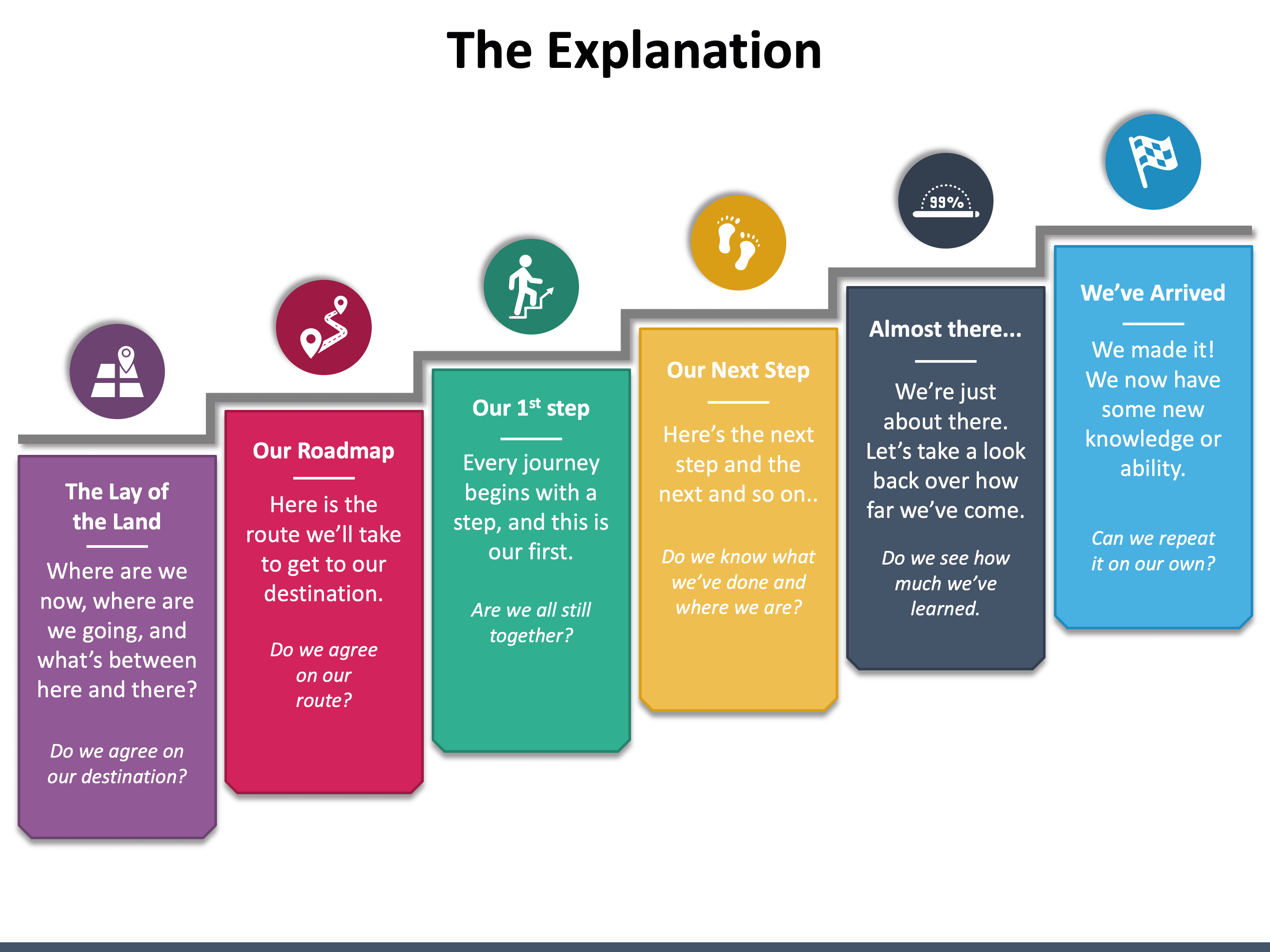
The common presentation structure follows this structure - Introduction, the main body of the speech, conclusion, Q&A session. You can incorporate problem-solution, demonstration, and story in the main body of the talk. However, the answers to the following questions will help you choose the right structure:
- What is the objective of your presentation?
- Who is your audience?
- What key message do you want your audience to take home?
Pro Tip: You can choose pre-designed PowerPoint templates to give a logical flow to the information and a professional touch to the overall presentation.
2. Less is more
Many presenters put everything they know about the topic on the slides for the sake of making the presentation information-rich. But the truth is, too much information in the form of bullet points or long paragraphs will only make your slides look cluttered and difficult to comprehend, drifting off the audience in a few minutes. Keep in mind that the audience is more likely to be enlightened, engaged, and influenced if you provide them meaningful information with fewer words.
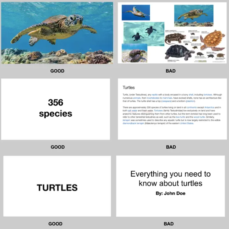
- Slides stuffed with too many images do more harm than good to your presentations. If you need to include multiple images, rather than putting them all in one slide, put one on each side.
- Use the fewest characters and words on slides to tell your story. Provide handouts or do follow-up emails if you want to furnish longer information.
- Keep titles and subtitles short.
Pro Tip: Your slides should not be a data/information dump; instead, they must be an aid to support your key points.
3. Power Your Slides with the Right Visuals
You will be surprised to know that the average attention span of humans (8 seconds) is shorter than a goldfish’s (9 seconds). So, to grab their attention really quick and keep them hooked to your slideshow without getting distracted, include the right visuals, and you are all set to deliver a gripping presentation. Moreover, adding visuals save you valuable time compared to writing out a whole bunch of text and increases your credibility as a presenter.

People tend to grab the information quickly and remember it for longer if it is presented in a visually appealing manner. Research also confirms that in comparison to plain text, visuals are processed 60,000 times faster. So, if you really want the linguistically diverse, neuro-diverse, and culturally diverse audience to get more out of your presentation, use high-resolution and good-quality visuals that reinforce and complement the core message. Depending on your presentation, you can include graphs, images, icons, videos, charts, infographics, screenshots, memes, or GIFs.
Pro Tip: Visuals do make a great impact if they are formatted properly, perfectly match with the slide content, and evoke the right emotion.
4. Keep the Formatting (Color and Font) Simple Yet Engaging
Your presentation acts as an ambassador of your brand. Misaligned text boxes, wrong line spacing, and other formatting mistakes may undermine your key message. In a nutshell, a poorly-formatted presentation can put your company’s/brand’s reputation at stake. So, take time to format your slides properly and give them a professional touch before you present them in front of the intended audience.
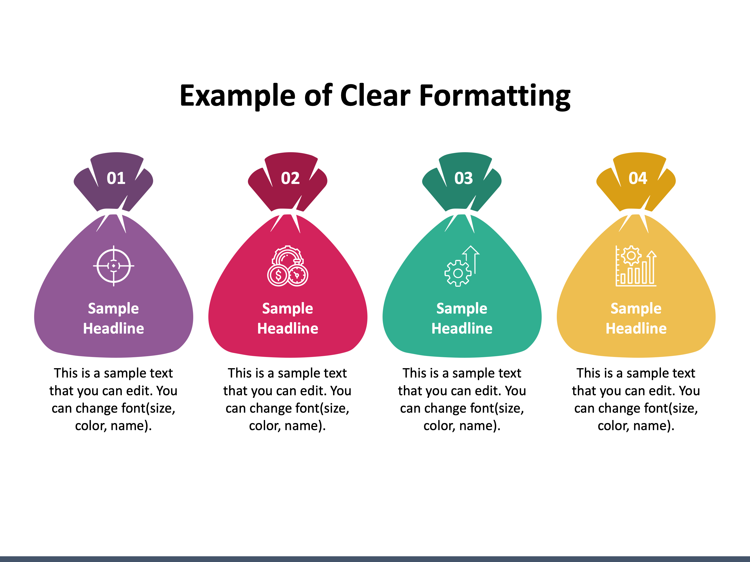
- Leave adequate white space around the text to give it clarity and an uncramped look. But refrain from double spacing errors.
- Use the right size and color of fonts to improve the readability of the content. Avoid using multiple font colors.
- For increasing comprehension, use contrasting color palettes for text and background.
- Keep the design consistent in all the slides.
5. Make it Audience-Centered and Interactive
The content plays a crucial role in connecting you with your audience. So, it must be precise, well-researched, contextual, and authentic. Highlight the problems that your audience is currently facing and how your product/service helps them overcome the challenge. But all these must be represented in an impressive and easy-to-understand language.
- Include only relevant and meaningful points.
- Avoid using jargon or technical language.
- Add a title to each slide to make your audience understand what the slide is all about.
- Make your slides interactive by adding questions, polls, surprising facts, and other icebreaking elements to keep the audience active.
- Allow the audience to ask questions and share their feedback to increase their participation and make your presentation a two-way communication.
6. Include a powerful Call-to-Action
End your presentation with an effective call-to-action (CTA) that guides the audience about what to do with the information you have shared and encourages them to take the right action.

- Choose the CTA that closely matches the purpose/objective of your presentation.
- The CTA should not be complicated and confusing; it should be concise and clear. For example, “Download Now,” “Subscribe Today,” etc.
- If you want to elicit a strong response from the audience, your CTA must be enthusiastic. For example, “plan your dream vacation today,” “buy now and get 60% off,” etc.
The bottom Line
The above tips will help you create a truly amazing presentation, but you can achieve success only if you deliver it with confidence. It is important to prepare thoroughly and practice a lot to deliver a unique experience to the audience. In addition, to avoid your slideshow from being a “snoozefest,” make your narration exciting and lively. Also, make sure you speak neither too slow nor too fast/loud.


